Collect your pensions - SEB
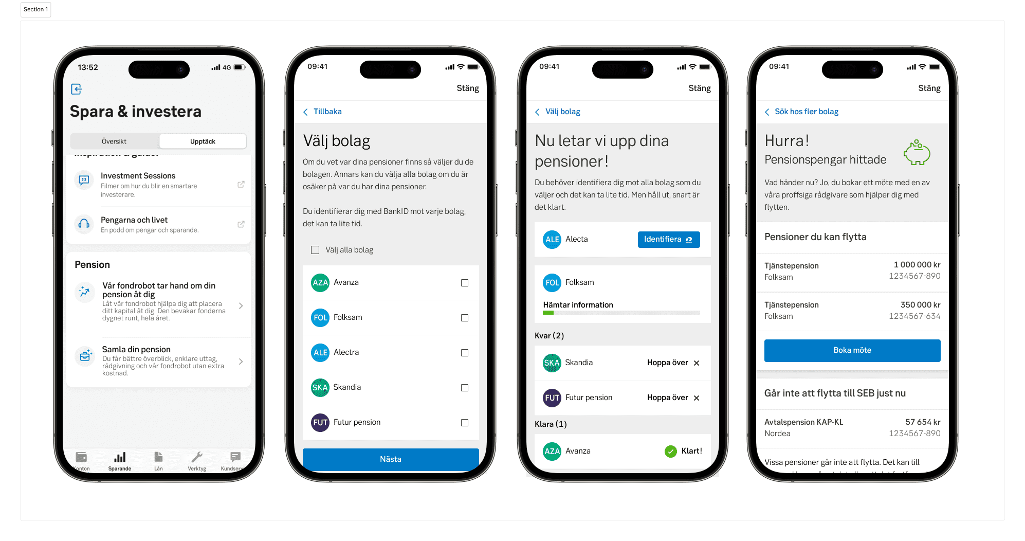
Find your pension data by searching through all the companies that provide pension insurance. Get an overview of them all and in easy and intuitive ways move them to SEB. Not sure where you have them? Search through all the companies or select the ones you know.
TL;DR
Summary
Created an MFE inside the SEB private mobile app. It allows customers to select any pension company in Sweden, search if they have pension insurances with them and get an overview of what pensions they have, what type and how much they are worth. With this information the customers can choose to gather all pensions to SEB instead of having them scattered.
Outcome
Having all pensions gathered in one place, it creates an easier experience for customers in that they only get one payment per month when retired instead of several small payments from many companies. It also gives benefits if the customer has other engagements with the bank. The project has accumulated quite a few new customers and clarity over how pensions work.
- Timeline: 2022 - 2023
- Roles: CX Designer, Researcher, UI Designer
- Tools: Figma, Accessibility
Challenge
The project aimed to expand the SEB offering. In this case, it makes it easier for customers to educate themselves about what kind of pension insurance they have, how much their current worth is, and how to easily collect them in one single place, SEB.
Some personal challenges were to create an application that was as accessible as possible, fun to use, and valuable as possible for both customers and client.
My Role
My role for this project was all the way from early research to pixel perfect design.
Research
I did continuous competitor analysis, interviews, and usability testing. I analysed competitors by getting as many screenshots as I could and found people who could show flows if they were customers of competitors. I gathered everything in Figma and workshopped around what was found. The interviews were mostly semi-structured with a few without scripts. I tested the usability by recruiting customers or by guerrilla testing. Usability testing carried through teams mostly with Figma prototypes.
CX Designer
I created wireframes, user flows, design walkthroughs, prototypes, and final designs. My main tool was Figma in this project. Using the SEB design library, green, I used mainly existing components and created a few of my own. Accessibility testing was carried out through voice-over on mobile mostly.
Approach
This project started with just some basic waypoints. We knew that it should enable customers of SEB to search for pensions and that it would live inside the private bank app. Everything from this quite loose scope to a sharp application inside the app was a long and exciting journey.
Competition analysis
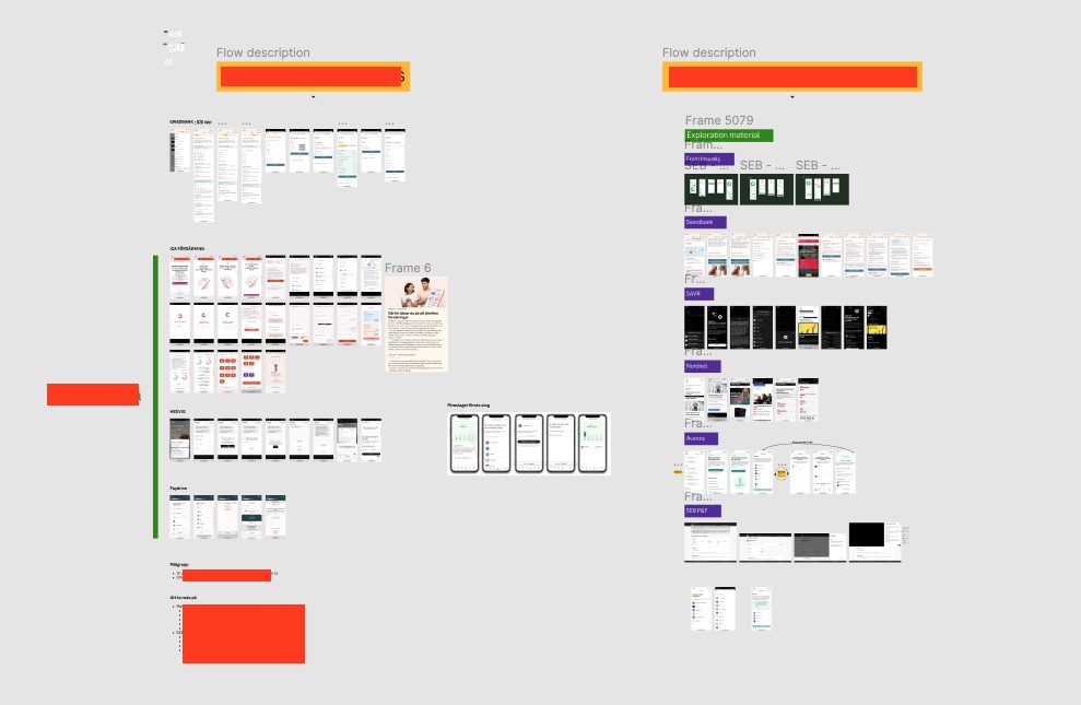
I scoured the internet and found examples of similar solutions and tried them out as far as I could. And asked friends and colleagues if anyone was a customer to whom I could not get access to understand those products. Picture of how that could look like in Figma:
Iterations and continuous design and interviews
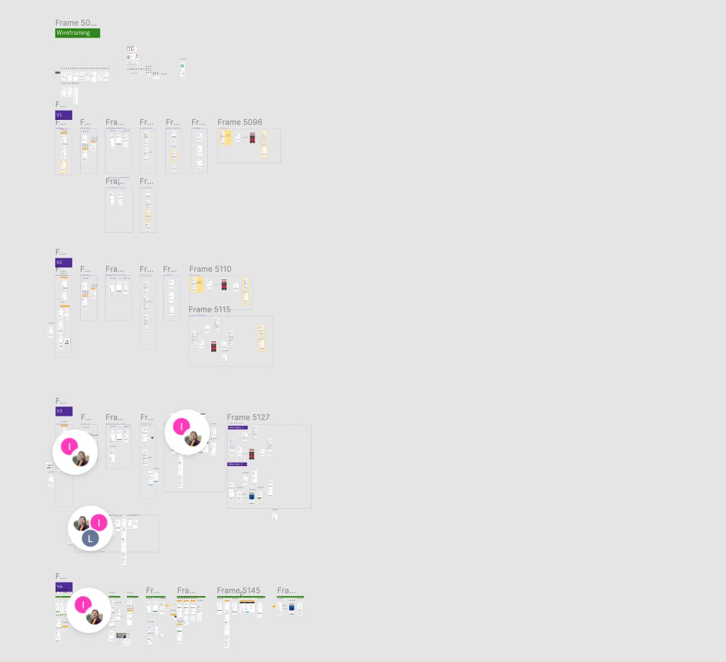
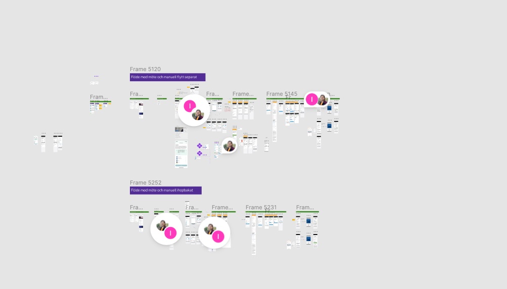
Following this I started with wireframes, tested them, and collaborated with UX writer to go forward. A lot of stakeholder meetings and requirement workshopping. Some pictures of my progress from Figma. I did a lot of iterations and explorations.
Final design and documentation
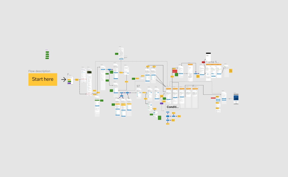
The final design with pixel-perfect designs was presented during development. We had a tight collaboration with the developers for a smooth workflow. The design was heavily tested with accessibility. I made sure the HTML semantics were good, alerts were presented right, and we could do the whole application from start to finish only using voice-over on the phone. The picture below shows an overview of what the final application user flow looks like.
Result
The feature is found under the savings tab in the mobile app.
